ONDA: Naples Hormone Clinic
Branding, Website, and Marketing by Cassio Marketing Solutions
The Brand Inspiration and Strategy Behind ONDA: Naples Hormone Clinic
ONDA, is the Spanish word for “wave” and symbolizes the natural rhythm and balance your body needs to thrive. During our research for this brand, we were inspired by the idea of a wavelength as well as the ocean waves found along the Naples shoreline. We melted these ideas to create a truly unique brand for ONDA: Naples Hormone Clinic!

“Thank you! It looks beautiful.”
Marina Casoliba
OWNER
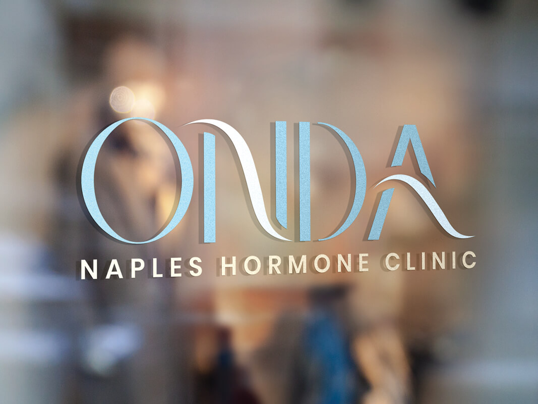
The Brand: ONDA: Naples Hormone Clinic
The curved lines in ONDA have been hand drawn, giving this brand an original font all its own. It feels free flowing, yet intentional at the same time. Each line feeds into the next, like a wavelength does, and keeps your eye constantly moving. The “waves” in the N and A were made to reflect both the ideas above while capturing interest and intrigue.
The font chosen for “Naples Hormone Clinic” is clean and grounds the logo. It adds stability to the brand without overpowering it.
The color palette chosen for ONDA takes inspiration from the beach where the waves hit the shoreline. It is calming and offers a welcoming feeling.
Overall, the ONDA brand embodies tranquility with a modern aesthetic. The look will reach their target market with a warm “hug” from day one!
Are you a medical professional looking to increase your brand awareness and industry presence? Let Cassio Marketing Solutions help you like we’ve helped ONDA: Naples Hormone Clinic!

“We recommend Katelyn Cassio, hands down!!!”
Marina Casoliba
OWNER


Visit ONDA’s Website