Hawks Nest Hub
Branding and Marketing Materials by Cassio Marketing Solutions
The Brand Inspiration and Strategy Behind Hawks Nest Hub
Hawks Nest Hub is a fun and creative online brand. They pride themselves on their affordable, high quality items that are attractive to a variety of target markets.

“I really love the wing of the Hawk on the H. I’m noticing all of the details… To me, the wing on the ‘H’ is touching, given my husband is in heaven.”
Katie Hawkins
Owner
The Brand: Hawks Nest
The brand colors are bold to appeal to the masses, while each line within the logo is slightly curved to create a welcoming effect. Red evokes the most emotion in individuals, and that is exactly what Hawks Nest Hub is set out to do.
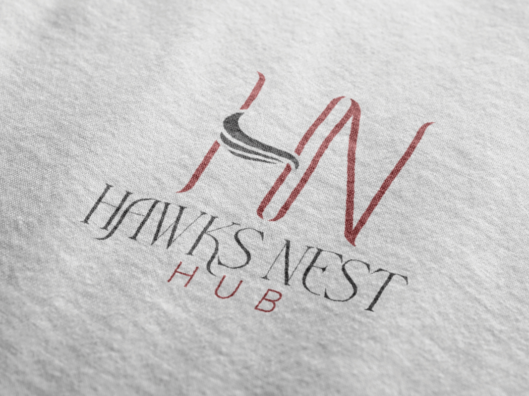
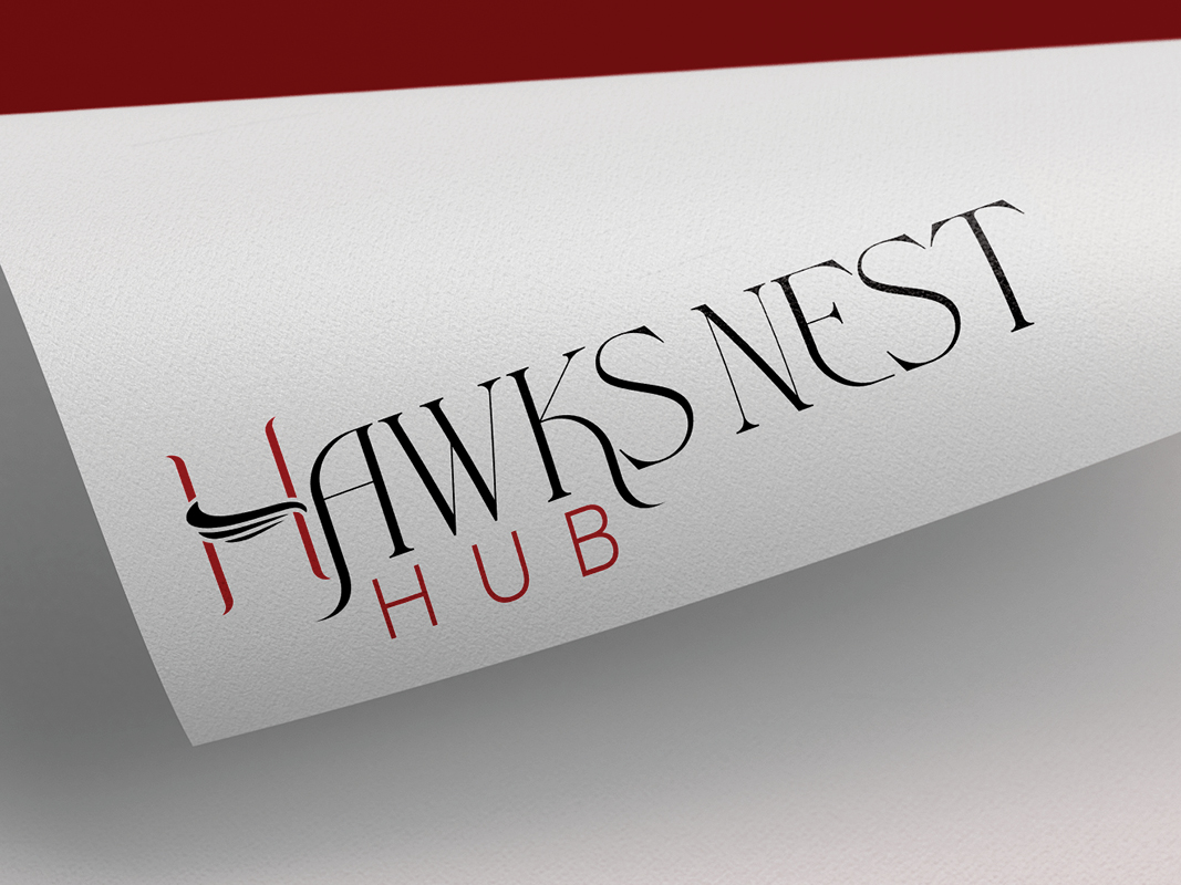
The brand’s primary logo acts as a grounded base to use first and foremost. It is balanced and shows strength. The subtle hawk wing in the “H” ties into the brand name without being so literal. It is truly as creative as the Hawks Nest Hub brand itself!
Hawks Nest Hub’s secondary logo offers a creative twist by using the “H” from the primary logo’s iconography. This version will be used in the website header, on horizontal marketing collateral, and more.
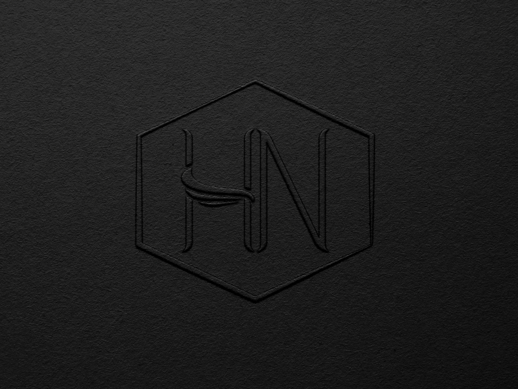
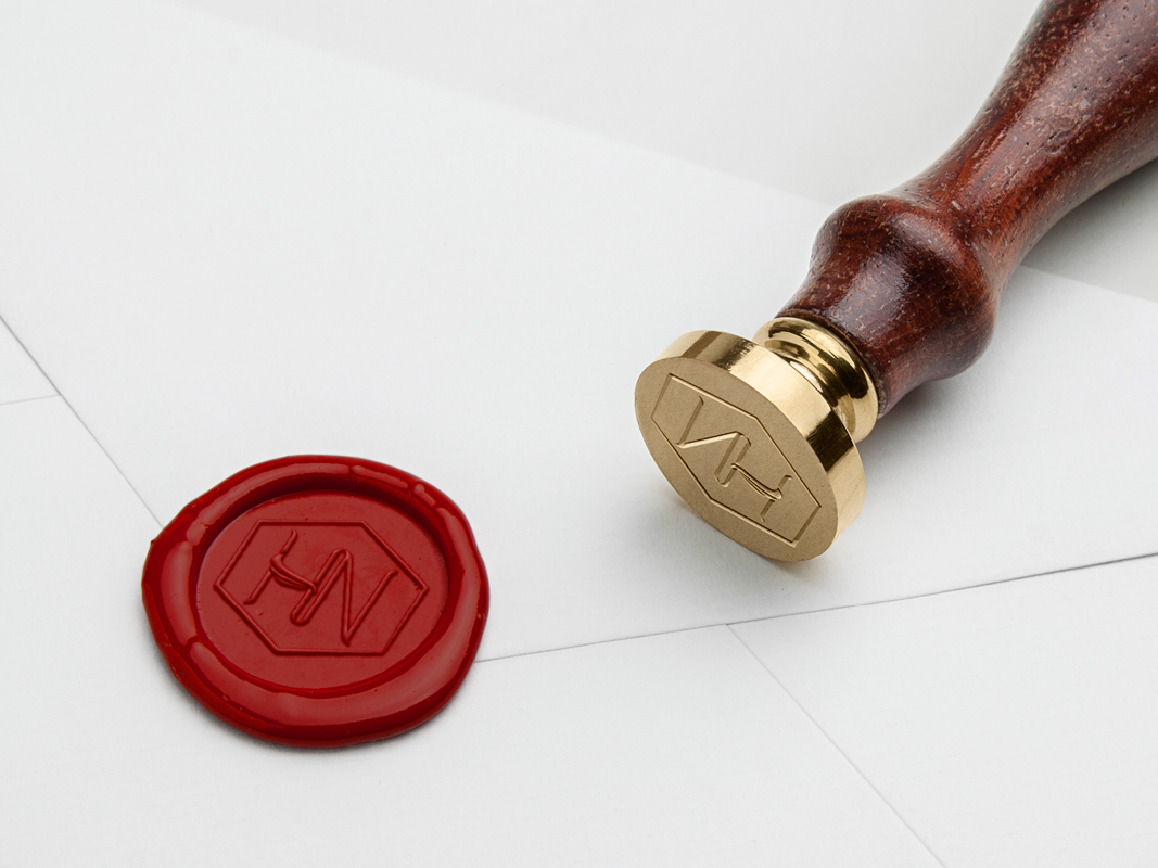
Lastly, the icon logo focuses on the iconography while embracing it in a cozy hexagon – similarly to an actual nest. This creates a sense of comfort and stability.The icon logo will be used as the website favicon, social media profile pictures, and more. Hawks Nest Hub is ready to be the “go-to” option for your online deals, full of diverse options!
Are you an e-commerce store looking to increase your brand awareness and industry presence? Let Cassio Marketing Solutions help you like we’ve helped Hawks Nest Hub!


“I love this SO much! All of the designs look incredible!”