Agent Design House
Branding and Marketing Materials by Cassio Marketing Solutions
The Brand Inspiration and Strategy Behind Agent Design House
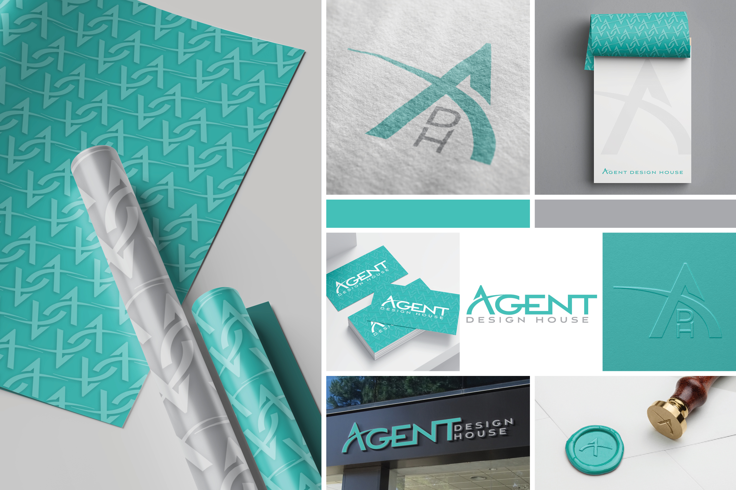
Agent Design House took full advantage of our branding process and got all the bells and whistles! We had a blast designing their primary, secondary and tertiary logos that seamlessly blended into their new icons and brand pattern. Their new look is bold, yet approachable. It mirrors the agency’s attention to detail while appealing to all industries. The design is distinguished and easily recognizable, the perfect recipe for success!
“The branding and logo look SO GOOD!!! I am obsessed with how things turns out and cannot wait to show it off!”
Kiera Flynn
Owner
The Brand: Agent Design House
Agent Design House knew they needed something to stand out from their competition. Knowing they wanted to appeal to REALTORS® made our job fun and exciting.
The “A” icon represents strength with its bold shape as well as comfort with the soft curve that cuts across it. REALTORS® always try to fit their client’s comfort and stability levels thus making this icon appeal heavily to them.
The color used in Agent Design House’s brand are vibrant and welcoming; two things owner Keira Flynn are known for. The grey gives a professional vibe while the teal shade offers a fun and outgoing personality to the brand.
Are you a creative agency looking to increase your brand awareness and industry presence? Let Cassio Marketing Solutions help you like we’ve helped Agent Design House!


“Everything you did is so unique and fits our aesthetic perfectly. Thank you so much Katelyn!!!”
Kiera Flynn
Owner
Are You Ready To Work With Cassio Marketing Solutions?
BOOK YOUR CONSULTATION


